
What more can I say?
What more can I say?

This is my take on the True Detective series. I’ve put a lot of emphasis on the show and don’t tell element focusing on the recurring motifs throughout the series. This piece follows the “Show, don’t tell” adage in order to capture the curiosity of the audience. The character is a loose representation of one of the protagonist detectives Rust Cohle. The band around the character’s eyes is a symbol taken from the Lady of Justice following the notion that justice is blind in it’s judgements. Both the antlers and the swirl are symbols from the victims in the series. With this heavy use of motif and symbolism I attempted to capture the surreal element in the series. To add to this effect I chose to construct the line work, shading and colour in a more impressionist fashion.
I began the process to create this poster by first basing a simple sketch off a scene with Rust sitting on his bed, I then scanned this and imported the sketch into illustrator. I used the trace image functionality to get a basic high resolution object to work with. I then began the line work with my graphics tablet. The shading was done in the in grey scale and after I was satisfied that I had something resembling the character in question I moved on to bringing in the symbolism. In new layers I began work on the antlers and the head bandage. To bring in color into the image I modified the opacity of the layers and set a background layer with the desired maroon color.
Well it’s been a long haul but I’ve finished my poster. Being that it’s three in the morning I can only hope this post comes across with some semblance of sanity. But that’s how it goes, you’ve got to be your worst critic the way I see it. I must say this assignment has really rekindled my hope for this program. I never really saw myself as more of a traditional artist until now contrasted with the new age platforms of the twitters and vlogs. Nonetheless I digress.
This assignment was my first opportunity to use my graphics tablet and I my first foray into Illustrator, both ventures I am happy I took. It should come as now surprise how complimentary Illustrator and Photoshop are however I was not expecting the seamless cohesion that I found. Establishing a canvas and blueprint in photoshop and then working with the pen tool in illustrator is as close as you get to paint on canvas I figure. This is the first piece of mine that really looks in my eyes at any rate as art in the most traditional sense, that is work with shading, colour scheme and overall presentation for the poster itself. To add to the last point I was really not expecting the formatting and typography element to be as fundamental as it turned out to be. The more you know.


I chose the above three designs to examine in terms of their typography. The Fire Within a film by Louis Malle is a story about an alcoholic writer just getting out of rehab suffering both the temptations to relapse as well as a lucidity that allows himself to see the lack of substance in the relationships of the people he had once called friends. I feel like the typography fits the mood of the movie. While as a title on a movie poster it is slightly understated however the way the red X frames isolates and emphasizes it. The font in question seems to me to be custom judging by the inconsistencies in the letters. The hand drawn element of this font fits with the confessional style of the movie.
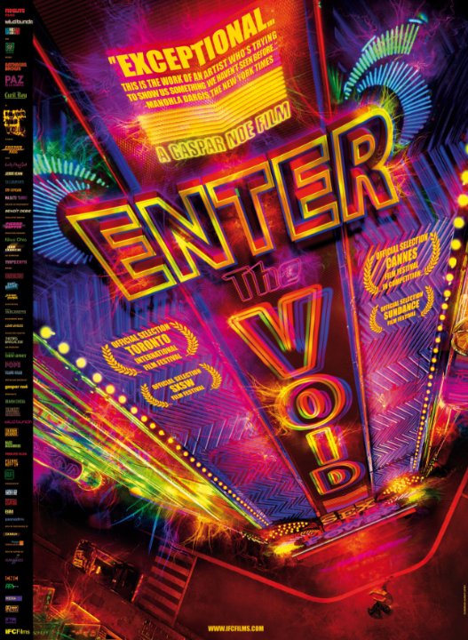
The second design I chose was the poster for Gaspar Noe’s Enter The Void, it is a psychedelic ride that plays with the metaphysical question of what happens when you die. Since this movie has a very distinct neon aesthetic, taking place in Tokyo, the choice of color in the typography gives you a good sense of what is to come. Secondly the placement of the title and the perspective that goes with it draws the eyes from “Enter,” downwards to the “Void,” which stretches to the ground. This perspective that pulls you to the ground fits well with the emphasis on death within. The neon colour choice evokes a psychedelic sensibility which effectively confers the movies content. However given the unorthodox alignment of the typography being both horizontal and vertical the middle word of the title really gets lost in all the colourful chaos. In addition the laurel parenthesized awards the movie won distracts and is barely legible. The font again here is a custom job by the designer Tom Kan.
Lastly is Joy Division’s album Closer. It was the band’s second and last album, in addition it was the last music Ian Curtis the lead singer of the band recorded before committing suicide. The band was known for it’s dark lyrics and Ian Curtis’ sonorous voice. I see this album cover as as close to capturing the essence of the music as possible. The band name stands tall with large kerning between the letters, it is justified in the center and it plays with the white space below and above it making it stand out that much more. The leading between the band name and the LP name is large enough that Closer doesn’t get lost beneath it. The font is Sarif font in the Helios family created by the album’s creator Peter Saville.
This exercise allowed me a chance to really meditate on the impact typography can make in a successful design. In the past I’ve overlooked the subtleties of this art not even knowing in fact that it is in art. Just as the Russell Shaw addage goes, “Good design is invisible,” well done typography seems like an organic piece of the design growing out of the ambivalence. From now on with my projects I will not see typography as an afterthought but instead an integral element of good design that can really unify a good design.
This week in tutorial we need some more work with photoshop, while much of this is review for me it has been beneficial to learn the true intended use of some of the tools at one’s disposal. I am about to start my poster project and I am excited to put to use my Wacom tablet for the first time. In addition I’ve also been really enjoying watching everybody get into PS, there is something really satisfying about getting to a place where PS is more an extension of the paint brush and canvas than it is a complex tool reserved for only graphics designers.


CRAP –> CONTRAST, REPETITION, ALIGNMENT, PROXIMITY
I chose the above three pieces to analyze in terms of what CRAP principles they embody.
The first piece, a movie poster for the film Drive. This poster embodies the contrast principal well with the silhouette around the figure and car. In addition the color contrast makes both the title typography as well as the scorpion really pop. While a minimalist poster there is repetition here too, quite simply the title acts is a sign which corresponds to the figure and car as the signifiers. When one sees the Drive typography they will immediately identify the figure in front of the car as the driver. As far as alignment goes, every element in the piece is justified to the center. Lastly the proximity of the title element, the tag-line and the scorpion all add to a easily understood aesthetically pleasing poster.
The second piece I chose is the poster for Melville’s iconic new wave noir: Le Samourai. The central element (Alain Delon) is in grey scale mounted on a white background so this poster does in some ways suffer from a lack of contrast. However the bold red typography stands strong and in opposition to Delon and the fact that the photograph itself has strong contrast does help it stand out. This piece does not have any extant repetition that stands out it could be argued it has some repetition in its symbolism. While the image a stoic man in a trench coat is not typically equated with a samurai, in this case the stoic and stern qualities which are often attributed to the samurai are present in the imagery. Irregardless of this, overall this piece is devoid of repetition. The alignment is strong and justified in the center of the image, the title stretches across the whole of the poster and the figure is centered beneath. Lastly the proximity too can be seen as a weak element in this piece being that the title hovers so far above the subject in question.
The third piece a vintage ad for the cigarette brand Viceroy. It is the oldest and I’d argue that of the three it follows the CRAP principles the most closely. It exposits a strong contrast between both the background and foreground as well as a between the text and it’s base. The repetition element is quite apparent in this advertisement being that the brand name is appears four times (the fourth is on the cigarette itself), in addition the use of the navy blue throughout all the text makes for a uniform aesthetic even with a change in typography between the speech bubble and the rest of the ad. The alignment fits with the rule of thirds quite readily as soon you appreciate the importance of the repeated brand name. However the alignment does suffer from the busyness of all the text that does not follow the logic of left to right reading. The proximity too suffers from this busyness as well in the same way.
Art Deco Examples then and Now:
1927:

Poster for Fritz Lang’s 1927 sci-fi opus Metropolis
2012:

The banner for the 2012 adaptation of the Great Gatsby
Prior to this week’s lectures I had a pretty traditional view of what digital media was. More specifically I only saw digital media as it pertained to my own art. To be quite frank I was quite set aback at first when we were discussing the broad forms that media takes.
After some consideration though I’m going to try and embrace the wide berth of media platforms that are out there. The way I see it now, each idea should take form in a platform that best expresses it’s message. So while I am still going to foster my love for the image arts
this program will allow me a chance to compliment those skills and provide for me a more well rounded skill set. I hope to see this goal through to the end so by the time I graduate I will have a portfolio that demonstrates my abilities in parallel and in junction with one another.
While this class may seem like a catch all prerequisite at first I understand its necessity. The necessity to broaden our horizons and to open jaded eyes with a fresh take on the many platforms digital media can take.

Photoshop is in many ways my platform of choice, its versatility and power cannot be overstated.
I have decided to go through the Lynda.com tutorials and learn the “right” way to use all the tools. While I get by just fine with my
jury-rigged knowledge on the subject it will be nice to know the kosher way to use each tool. And seeing as I just invested in a wacom tablet it should give me a chance to get the hang of a graphical input. I see this class and more broadly this faculty as an outlet for my know-how as well as a catalyst for ambition. I wish I could say I was happy with the above result of the first lab’s progress, even though my end result looks just as it should I feel as if I did not challenge myself enough in completing it. It is not enough to simply satisfy the requirements and now that I have an understanding of expectations and limitations I must force myself into each assignment and lab no matter the apparent restrictions.


